A color managed workflow when dealing with 3D rendering can be handled in a few different ways, depending on your application and rendering methods.
Almost none of the 3D applications in 2009 are color managed at this point. LightWave 3D can be color managed through a plugin, and then you even can use ICC profiles for textures, like painting textures in Adobe RGB. LightWave 3D is the only 3D application that can be made fully color aware as far as I know. modo, I am looking at you, please – pretty please, include color management for the next release.
Anyway I’ll start with the assumption that the 3D renderer isn’t color aware, which is true for most applications out of the box (LightWave 3D, modo, 3dsmax, ZBrush and so on).
As I’ve mentioned a few times already, working in a non color managed application on a wide gamut monitor causes oversaturated colors, and that is of course also true for non color managed 3D renders. The effect of this is that when you have spent the time tweaking your render’s colors to perfection, and open it up in a color aware application nothing looks like you expect – probably you will see undersaturated colors as you probably have compensated for the wider gamut’s oversaturation by using colors with less saturation.
This is normal, as you have been working in your monitor’s non-standard color space and saved an untagged image without any embedded ICC profile. When this untagged image opens in Photoshop it probably automatically assigns the sRGB profile by default (or whatever working space that is set as default) – which has a much smaller gamut than the monitor – and there you have it, undersaturated colors.
But in the Photoshop Setup section above we fixed this, didn’t we? We enabled the alert for opening an untagged image so we can set the correct ICC profile, that’s why I wanted to start with Photoshop before heading into the renderer.
The Nonlinear Workflow
This is probably the most common way of working. Computers and displays are usually working at a gamma of 2.2. And gamma 2.2 is what most 3D renders by default is rendered at. So if you haven’t messed around with or cared about any gamma settings – this is your workflow. You are working with nonlinear images, ie – images with a gamma curve compensation encoded.
“In a typical color managed workflow between different color spaces, an image begins its life containing or designed for a device-specific source profile – which in the case of 3D rendering usually is the monitor profile – and then should get converted to a standard, perceptually uniform workspace (such as ProPhoto RGB, Adobe RGB or sRGB) for editing and archival storage. Media-specific versions of the image are then converted to the color spaces for the media where they’ll be used (web, print, film and so on).”
Anyway, let’s say I have a render that I am happy with, saved out in a standard 24bit format like tiff for example, and I am ready to edit it in Photoshop. The image is untagged so when I open it in Photoshop I’ll get presented with this dialogue which asks me if I want to assign a profile to the image.

Assign an ICC profile to an untagged image.
In this dialogue, if I’d go with the working RGB (sRGB in my case) which would be the default most of the times, I’d end up with a very undersaturated image. If I go with Adobe RGB I get an image that’s pretty close to my render, but still a bit undersaturated. If I go with ProPhoto RGB I also get an image that is quite close to my render but this time a bit oversaturated instead.
Instead, to quote a few paragraphs above: “an image begins its life containing or designed for a device-specific source profile”. The 3D render created in a non color managed application is designed for how it looks on the specific display it was created on. So when I open it for the first time in Photoshop, I assign my measured monitor profile to it, in my case the Dell 2408WFP(Digital)-1 profile. By doing this it opens up exactly in Photoshop like it looked when I rendered it in my 3D application.
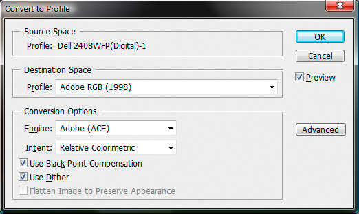
Now we need to leave the single workstation color space and move the image into a standard color space, so in Photoshop we need to go to Edit » Convert to Profile which brings up this dialogue.

Convert from my monitor specific profile to a standard color space, like Adobe RGB.
In Source Space the current space is already set (My Dell monitor) and for the destination space – set it to what is most suitable for the occasion. Personally I only use sRGB, Adobe RGB or ProPhoto RGB. I use sRGB if I shall go to web, Adobe RGB when I work with standard 8bit/channel images and ProPhoto RGB for 16/32bit per channel images.

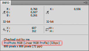
ICC Display in Photoshop Info Panel
And there you go, now your image has left the wild wild non managed color world and are correctly managed from this point and forward.
A quick Photoshop tip, to make sure you don’t forget to assign or convert to the correct ICC profile for your images. I keep the Info panel in Photoshop constantly opened, and in the Panel Options for the info panel you can enable Document Profile. Then the info panel will at all times display the assigned profile for the document you are currently working with, as can be seen in the screenshot to the right.
Conversion Intents
This could be a good time to mention the Intent setting in the Conversion Options section in the Convert Profile dialogue. The color gamut is the range of colors a specific color space contains. The intent is the method by which Photoshop forces the gamut of a larger color space to fit within the gamut of a smaller one. This setting doesn’t come into play when going fram a smaller to larger color space, like going from sRGB to ProPhoto RGB. Going the other way with highly saturated colors, the setting can be important how to handle the high color values not covered in the smaller gamut space. Relative Colorimetric or Perceptual is the two most common ways to handle conversions to smaller gamuts.
- Perceptual
The perceptual intent maintains the relationship between colors to retain the overall image appearance. When there are colors outside the gamut of the destination profile the colors gets compressed to fit within the profile. In other words, all colors in the image get shifted slightly to maintain the relationship. This method can cause an overall loss of saturation and lightness. Perceptual is a good choice if many colors are outside the gamut of the destination space and you don’t want to have them clipped. - Relative Colorimetric
The relative colorimetric intent keeps all colors that fits within the destination gamut unchanged. The colors which are outside that gamut clips to the closest matching in-gamut color, the hue value. Some saturation and lightness might get lost in this change. This intent maps the white in the source to white in the destination to keep it as accurate as possible. This is a better choice than perceptual for images with few out of gamut colors as it maintains the appearance of more colors in the image. If there are many of out of gamut colors banding could occur on the edges of the gamut though. - Absolute Colorimetric
This intent works almost identical to the relative colorimetric intent with the exception of how white is handled. Instead of mapping white to retain a pure white in the destination, it retains the white point from the source space. This can cause a color cast in some color profiles and is not used that much, except for proofing. It is useful though when going to a printing profile where white is supposed to have a cast (usually when printing to paper). It’s useful in After Effects as well when working with film stock profiles, which is were I use this method. - Saturation
Saturation maps the out of gamut colors fully saturated which gives pretty vivid colors. As this mode doesn’t regard the hue, the out of gamut colors can obtain a different hue value if it doesn’t exist in the destination. The saturation intent does not change colors that are within the gamut of the destination profile. Saturation is mostly used for business graphics and charts – nothing I use in my workflow.
As perceptual and relative colorimetric are the most useful intents in this workflow, and the decision of which to use is most commonly depending on how many colors that are out of gamut, it would be handy to be able to check that. In newer Photoshop versions the convert to profile dialogue has a preview checkbox, so you could actually skip checking the out of gamut colors and just try both modes and see which looks best on the fly. But still, if you want to check it for yourself, Photoshop has an option to do just that.
First go to View » Proof Setup » Custom and select the color space you intend to convert to, like sRGB for instance. Then you will find the option to check the out of gamut colors under View » Gamut Warning. Enabling this option will change all Out of Gamut colors to a medium gray to quickly spot them. You can change the gray to any color you like under Preferences » Transparency & Gamut » Gamut Warning. Gamut Warning is a proofing mode, so disabling it again will naturally return the colors to like they were before. This is a handy option sometimes to be aware of.
Photoshop Saving
Adobe has done a fine job with color management in the CS4 suite, and by now you shouldn’t have any problems getting your 3D renders into Photoshop, with all the colors looking as intended and then brought into the color managed workflow.
Also, you shouldn’t be surprised anymore when colors differ inside and outside of Photoshop, as we have discussed that a great deal by now, and that should be the expected behavior – which is completely normal and correct, especially on a wide gamut monitor.
As I mentioned briefly earlier, don’t ever – ever – try to use View » Proof Setup » Monitor RGB in Photoshop to make the image look the same in the Save for Web dialogue as on the Photoshop canvas as suggested here and here and on many other sites. That is just plain wrong, and the authors have not understood how color management works and how today’s displays are constructed. Those “advices” will only make the colors look like you want on your own screen and they will probably go completely bazonkas on some other display.
But we know better now, right?
Save for Web & Devices
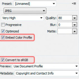
When saving your images to be displayed on the web, Adobe Photoshop CS4’s Save for Web & Devices does the job quick and easy. There is options built in to the save for web dialogue window to both convert the image to sRGB color space as well as embedding the profile into the image. If you’re working in any other color space than sRGB (like Adobe RGB or ProPhoto RGB) you need to keep this option checked to make sure the images for the web gets saved in a format that all visitors can see correctly. I leave this option checked all the time.
Also, to avoid oversaturated colors of my images on wide gamut displays I have started to also embed the sRGB ICC profile into the image, so assuming the visitor is using a color managed browser (like Firefox or Safari), the image will display correct as well.
Article Overview
- Introduction
- Display Calibration and Profiling
- Photoshop Color Management Setup
- » Color Manage 3D Renders in Photoshop
- The Linear Workflow
- Render Display Soft Proofing
- Compositing and Editing
- More Applications and Conclusion


Sorry if I’m late to the party here. Great article, and I have to say I understand color management so much more than I did before…. but, (you knew that was coming), I’m still a bit confused.
For instance, when I follow the steps you have outlined for Save for Web & Devices, in the Optimized preview area, with the settings you have outlined, the image shows that converting to sRGB will make it look dull/undersaturated. Why is this? When I preview the image in Chrome or IE, it looks oversaturated; NOTHING like the preview was showing me.
I’m using a Dell U2711. I do not have the dough for a hardware calibration tool. What would you recommend as the “best poor-man’s display calibration tool”? Windows 7 display calibration, or a utility that came with your video card (nvidia’s control panel)?
Also, what should your monitor settings be, along with the color management settings in Windows 7? Right now my monitor is set to Adobe RGB preset, and Windows has two profiles listed, a Dell U2711 profile, and sRGB. How do these relate to Windows Color System Defaults and ICC Rendering Intent to WCS Gamut Mapping, and what should these settings be?
Thanks again for your efforts.
Awesome article, Johan, thank you so much.
Bruce, to answer your first question, if I understood the article correctly, this is probably because your monitor is wide gamut, and IE nor Chrome are color managed, would be my guess. The preview is correct because photoshop feeds your monitor the correct values, takes into account the wide gamut icc profile and prevents you from seeing the RGB image as oversaturated.
I’m curious, Johan; If you use the “and then convert document to working RGB” when opening and assigning your display profile, what render Intent does the conversion use in that auto-step? And is it OK to do so, as opposed to converting the file yourself (as I see you don’t use it)?
Thanks,
deg
Hello Johan,
Your tutorial is the most clear and straightforward one I have found so far and made me understand many things.
One thing is a bit confusing to me on the “Save for Web & Devices” section. Is it still necessary to embed color profile (sRGB) since you do a conversion for example from dell monitor profile to sRGB? Assuming that the converted to sRGB image is untagged and opened in a not color managed application. Wouldn’t the application assign automatically the sRGB profile and will look correct without being tagged?
Thank you.
George,
Some color managed applications assume that untagged images are sRGB and display them accordingly. Some applications don’t do that. Let’s take Firefox as an example, by default Firefox color manages images tagged as sRGB but do not color manage untagged images.
You can change that behavior by editing the gfx.color_management.mode config and change it from 2 to 1 to also color manage untagged graphics. I’d guess most people have it at the default value though.
So embedding an ICC profile keeps you a bit safer that the image will display correctly on a few more systems than if you don’t. With the cost of a few extra kB of bandwidth.
Cheers,
Johan