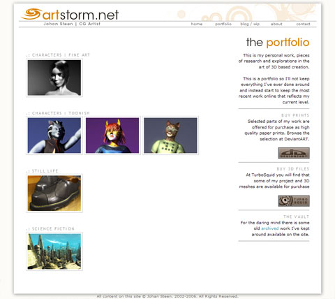
Woah, I finally got disillusioned. I’ve had a brownish design of artstorm over the last years.
But a few month back I killed it of for a lighter white design for the reasons I wrote about in this entry, artstorm is dead, long live artstorm. Well, a few months later when I’ve got some perspective to the design and been living with it over the time, I realized that I never got the cosy at home feeling with it. I simply didn’t like it.
So I took some time this weekend to fix it to something I like, so here we go again. Coffee colors all over the place. And oh, I like it so much more. So this new look will be the one that will be here to stay for quite some time. I also took the opportunity to fix some other problems that have been a disturbance to me and also removed all transitional HTML code and rewrote all pages to XHTML 1.0 Strict/CSS. The blog software also got updated to the newest version at the same time.
So bye bye, artstorm light…

Artstorm Version 2 - Shortest life span ever of a design.
Designing Music: Caesars Palace – Cherry Kicks
